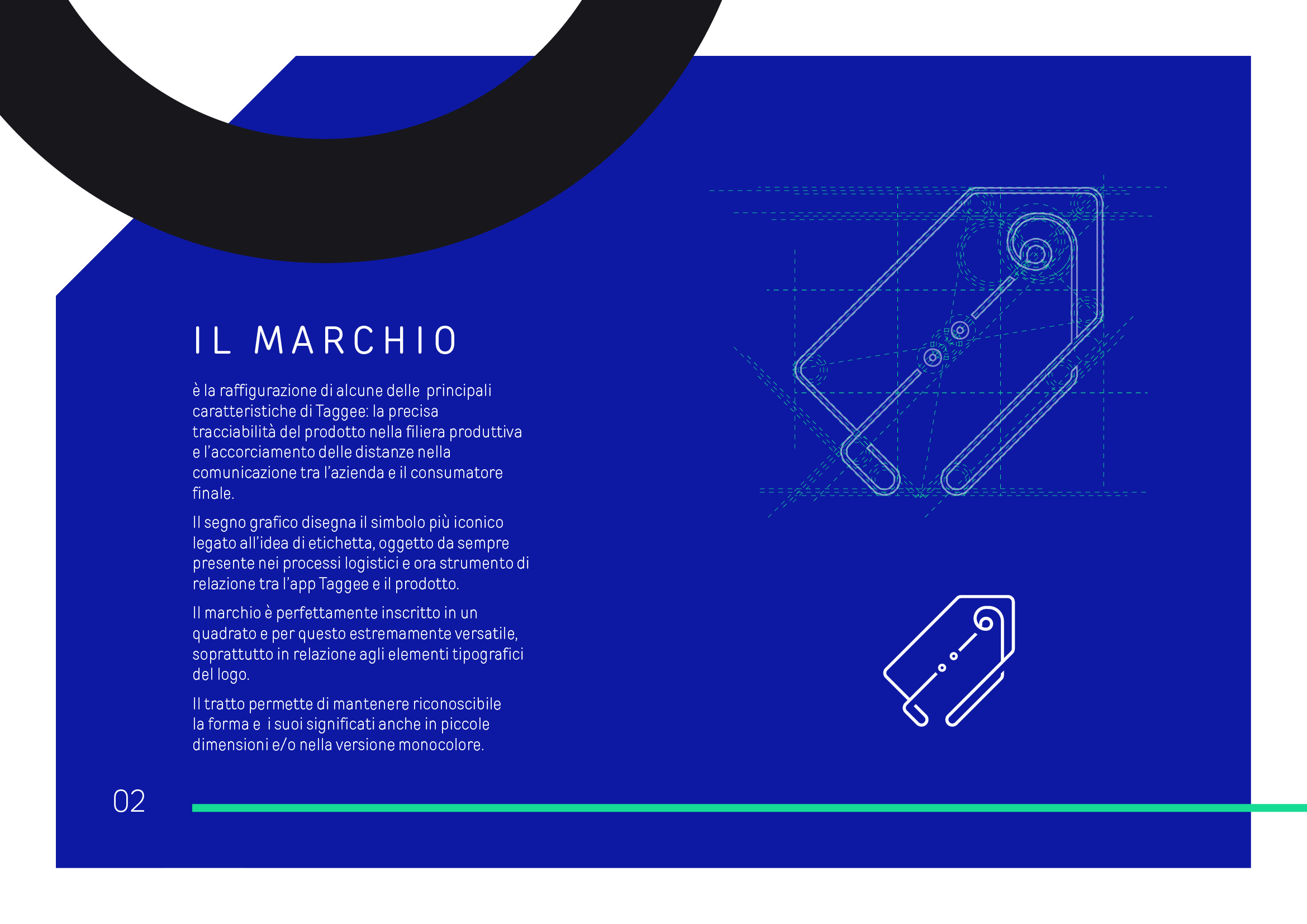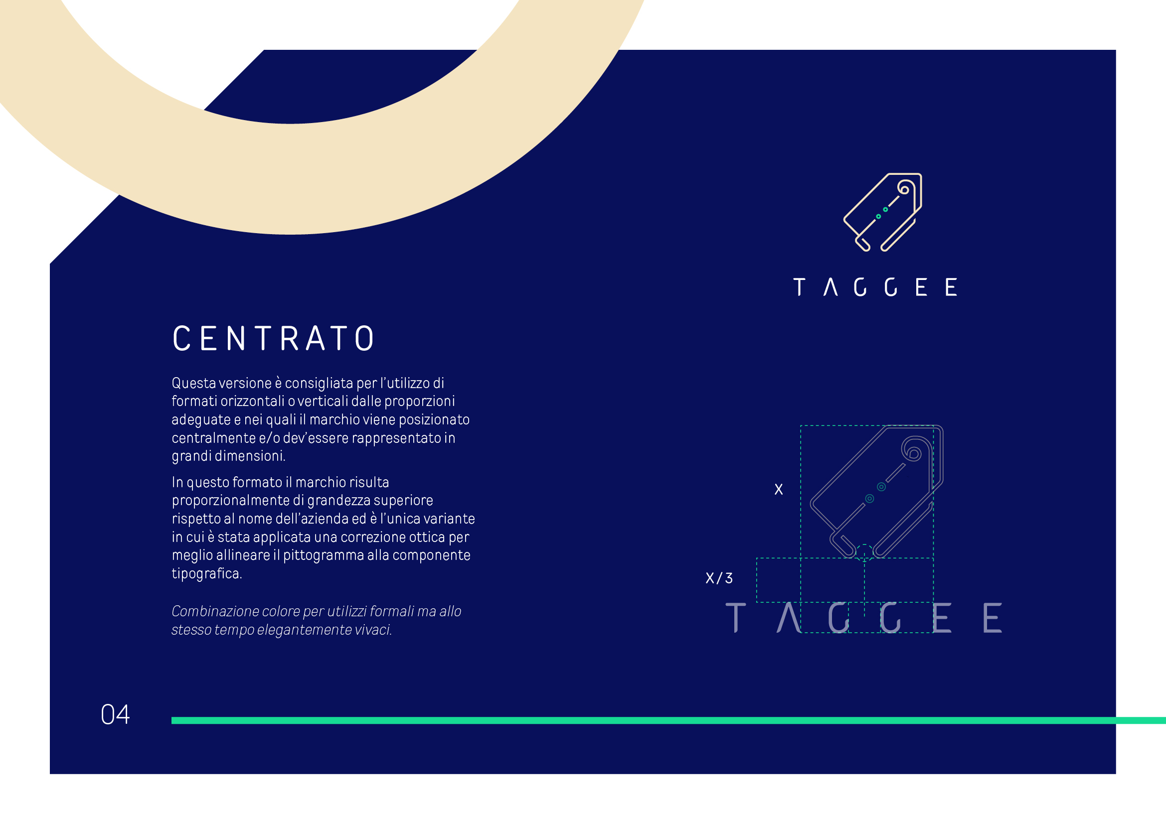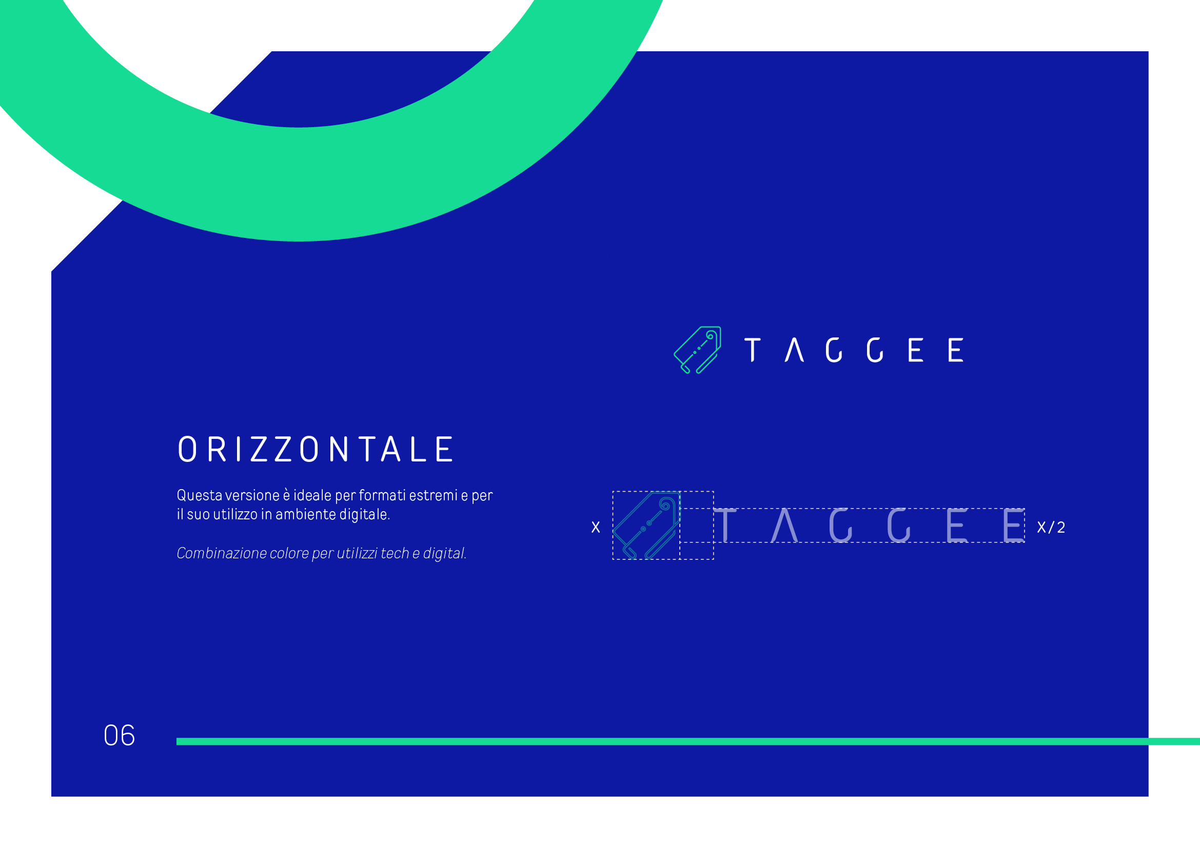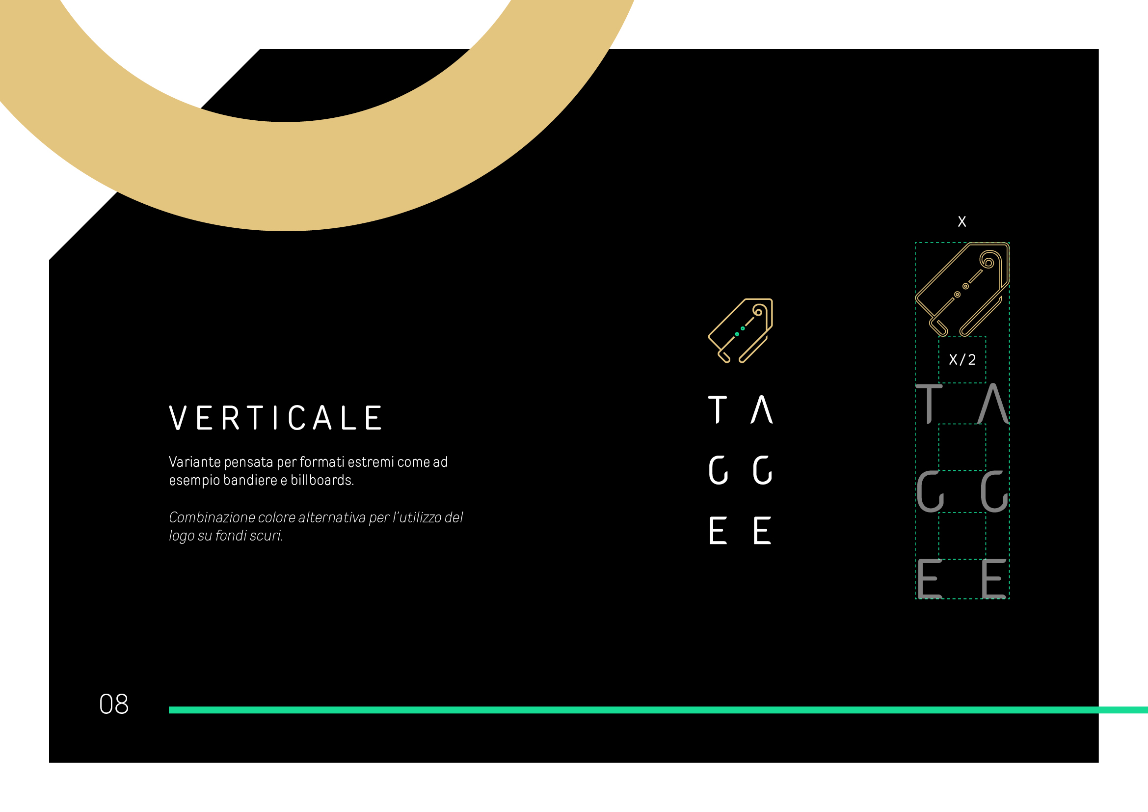
The logo represents the main Taggee’s key features: precise product traceability within the production chain and the shortening of distances in communication between the company and the end consumer.
The graphic sign depicts the most iconic symbol linked to the idea of a label.
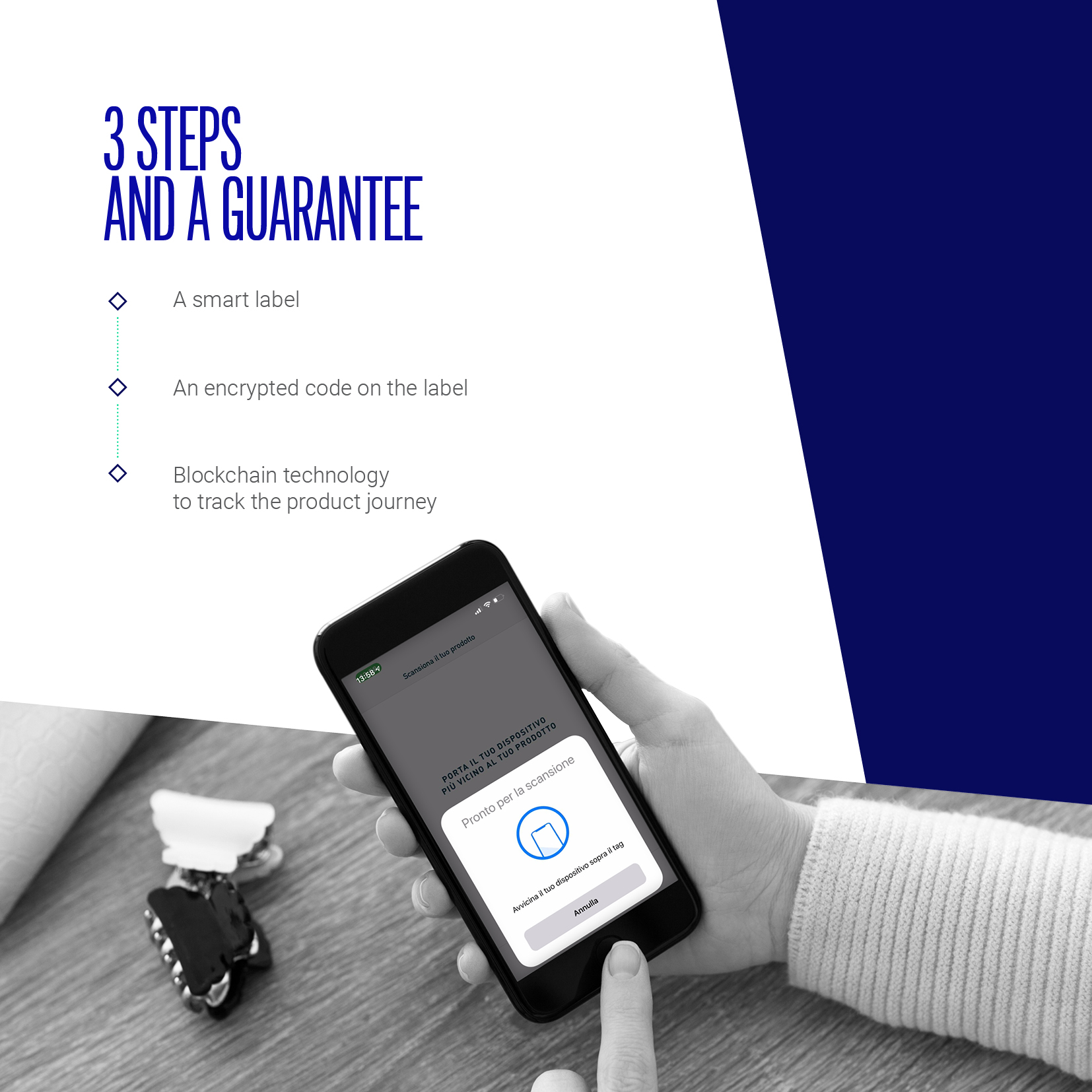
An object always present in logistics processes and now a tool for connecting the Taggee app with the product.
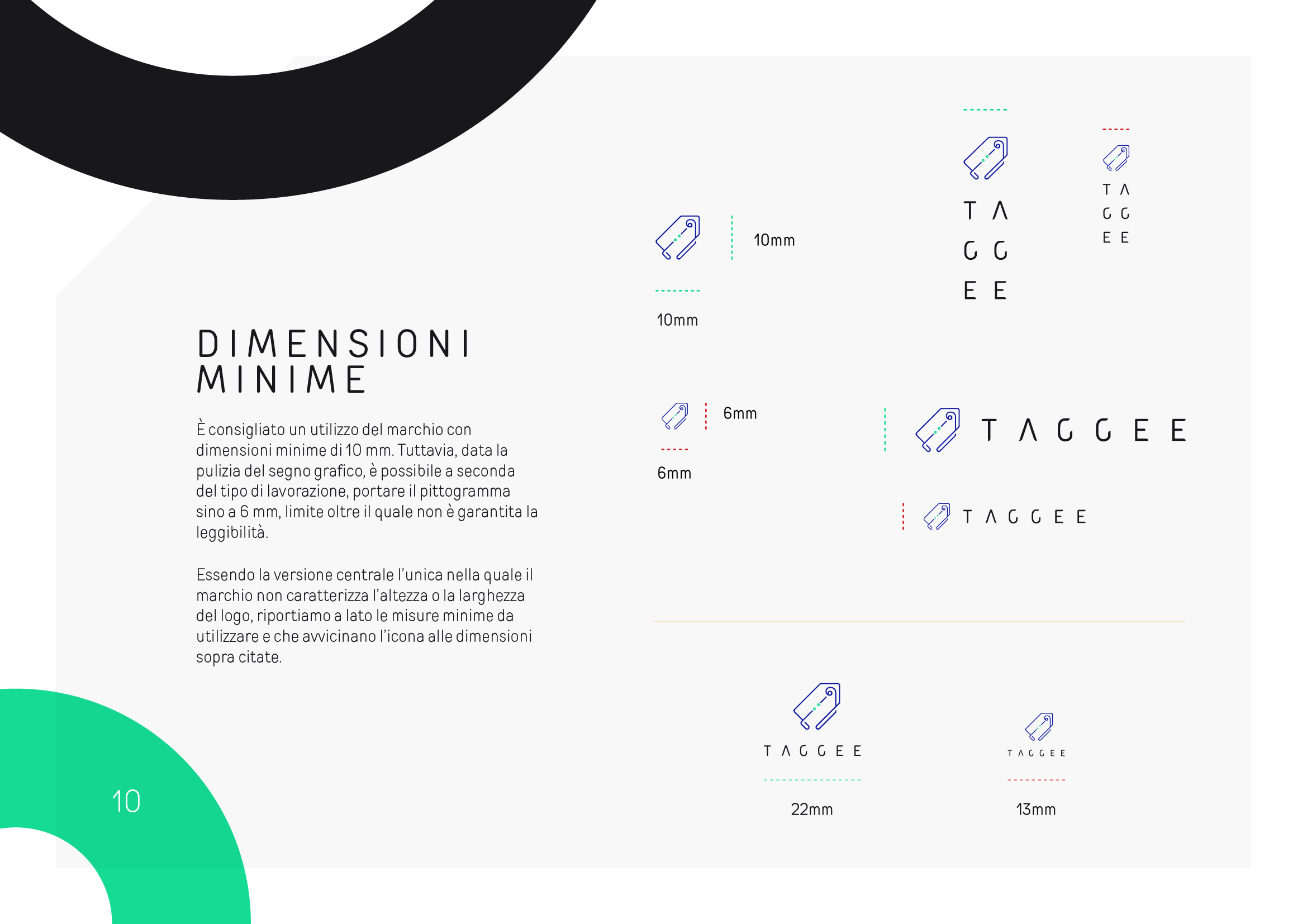
The mark is perfectly inscribed within a square, making it extremely versatile, especially in relation to the typographic elements of the logo.
The line ensures that the shape and its meanings remain recognizable even at small sizes and/or in the monochrome version.

